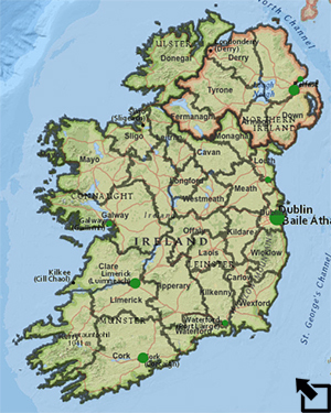
Scale matters. Viewed at the county level (center
below) Counties Mayo and Wicklow clearly experienced the famine
differently. A closer look (maps right and left), though, reveals that
there were pockets of similarity that are missed at the larger scale.
Each Irish county is subdivided into electoral districts and looking at
the famine data through a finer lens at this smaller scale provides a
more detailed perspective on the impact of the famine.

County Mayo


County Wicklow
The local stories of the two counties and the different famine experiences of each are best expressed in local, contemporary sources. Imagine yourself a recent Irish immigrant to the United States in 1850. You try your best to keep in touch with events back home, even sending what spare money you can. The table below contains a packet of resources for two such individuals - one from County Mayo, one from County Wicklow. The resources included go beyond personal letters. They include newspaper articles, government reports, excerpts from personal journals, a painting, and a ship's manifest.
- Select the materials from one of the counties.
- Carefully study the items included.
- Write a summary of what you learned about the famine experience back home in County Mayo or County Wicklow.
1) Read an article prepared by one of your classmates for the other county. Compare and contrast their observations with yours about the different experiences reported in the two counties.
2) Not all places in Ireland are suitable for agriculture - even for the growing of potatoes. Load the Famine in Ireland - Two Counties map. Look at the country at the county level in the Famine layer and Change Styles to examine the % Land in Crops 1851; that is, find the percentage of land in each county that was used for agriculture. Select Options and set the sliders on the histogram to 30 and 10. Notice that the average is 30% of the land in crops.
Now switch to the local level and the electoral districts in Counties Mayo and Wicklow. Compare and contrast in terms of the % Area in Crops 1851 across the electoral districts in each county. Make sure that you set the Options histogram slider in each case to 30 and 10 as you did at the county level so that the maps give you the best possible comparison.
3) Compare population densities of the two counties. A good place to
start is to Show table for County Mayo and to look
at the Statistics for the Population
Density 1841. Note what the Average is
and Filter the Mayo data to show just the
electoral districts that are at least average. Next visit County
Wicklow (Bookmarks) and filter the population
densities there to show just those districts where the value is at
least as big as the Mayo average. Describe the results and your
conclusions.
4) Do a similar analysis and discuss the dependence of each county
on potatoes and oats. What do you notice about the electoral
districts where the dependence on oats/potatoes was highest/lowest
and the percentage of change in the population between 1841 and
1851?
5) Describe how the % Change in Population 1841 to 1851 seems
to be related to the % of the Area in Crops in 1851
and the % of Cropland in Potatoes at both the
county level and then at the electoral division level in Counties
Mayo and Wicklow.
6) Think back to the documents you read above and the comparison of reports you did with a classmate. Discuss how the different experiences in each county reflected in the documents are reflected in the comparison of % Change in Population 1841 to 1851, Population Density 1841, % Area in Crops 1851, and % of Cropland in Potatoes and Oats in each county.
Last modified in May, 2015 by Rick Thomas
